Introduction:
Gestalt is a German word that means “shape or form”. The Gestalt term refers to a group of visual perception principles developed by German psychologists in the 1920s. These principles are built on the idea of how people tend to organize visual elements into groups.
“The whole is other than the sum of the parts.” — Kurt Koffka
How to improve User Experience using gestalt principles
An understanding of gestalt principles helps designers organize and arrange the User Interface elements in a way that influences the user behavior. This, in turn, will result in a great user experience.
The Gestalt Principle
1-Proximity
Proximity occurs when elements are placed close together. With proximity, elements tend to be perceived as a group.
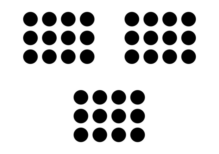
People would figure 3 groups of circles instead of 36 individual circles

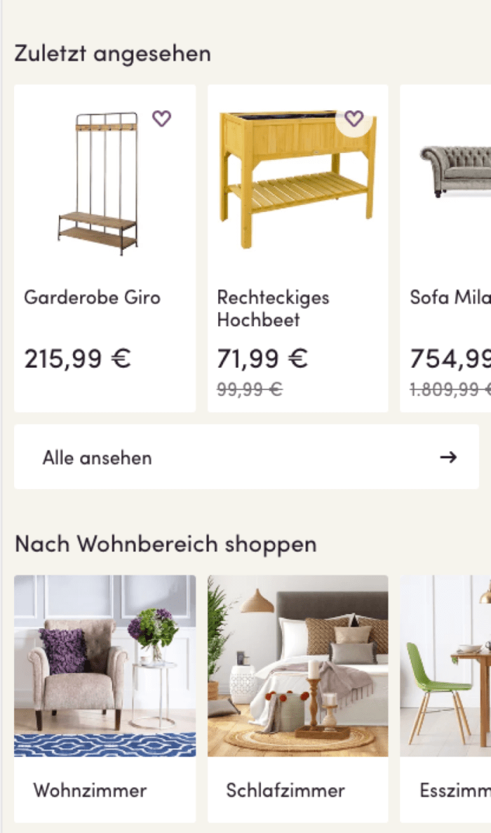
Gmail Mobile site
In case of Gmail, each row has different elements that are grouped together before seeing the next email:
- Check box on the left side.
- Three lines of text that are grouped closely together.
- A starred icon.
- A white space between each row.
In order to emphasize the grouping, there is a line between each email.
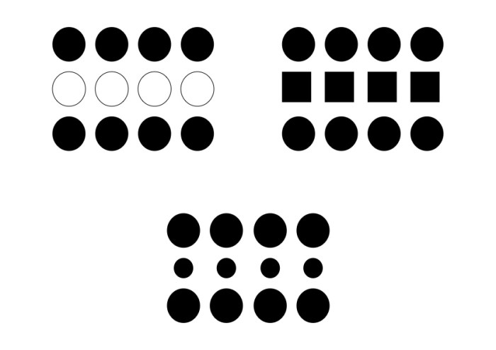
2-Similarity
Similarity occurs when objects look similar to one another. People often perceive them as a group or pattern.
Similarity
What we see in the above image is still the three groups, but in each group, there are some elements that have different visual characteristics. They differ from the rest and perceived as a group.
- On the left side, the difference appears in color (4 white circles).
- On the middle, the difference appears in size (4 small circles).
- On the right side, the difference appears in shape (4 squares).
When users look at things that look similar, they expect them to belong together and behave the same. If something looks different users expect it to not belong to the rest and behave differently.

To-Do App
TO-Do-App is a good example of grouping by color, where the task marked done is featured in a different color from the tasks that are in progress.
3-Closure
Closure occurs when an object is incomplete or space is not completely enclosed. If enough of the shape is indicated, people will perceive the whole shape by filling in the missing information with their minds.
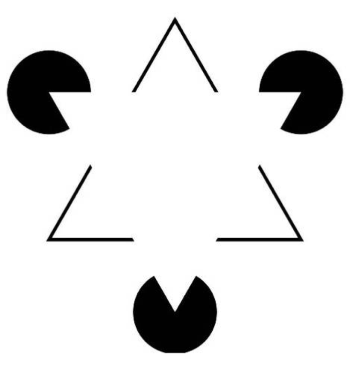
Closure
a closure is something we use to make things whole; the human mind is so used to things having to be complete that if something is incomplete we’ll start looking for the things that are missing. In the image above there is no triangle but you have to try hard to not see the triangle!
Wayfair Mobile Site
Wayfair uses the closure principle to tell the user that there’s a swipe on this page. In this example, Wayfair leaves one image in the carousel incomplete so that the user knows there is more to see.
Conclusion
Gestalt principles help designers understand how the human mind works and equips them with the necessary knowledge to create a pleasant user experience.
Other Gestalt principles
- Figure and Ground
- Continuation
Further reading
3 ways to improve your visual design skills
https://uxdesign.cc/3-ways-to-improve-your-visual-design-skills-fa9dc8e583ff
Gestalt Theory for UX Design: Principle of Proximity
https://uxplanet.org/gestalt-theory-for-ux-design-principle-of-proximity-e56b136d52d1
Lead Generation through Gestalt Design Principles
https://medium.com/@daizyjain1704/lead-generation-through-gestalt-design-principles-7951931e0654
Resources
https://www.neurosciencemarketing.com/blog/articles/gestalt-principles.htm
https://medium.muz.li/gestalt-principles-in-ui-design-6b75a41e9965
https://uxplanet.org/how-to-improve-ux-using-gestalt-principles-ab74bdd6a375
